ALEJANDRO
MANCHA
Graphic Designer/Illustrator
PARTAKE:
Making Joy Visible on the Shelf
2025 - Print, Packaging, Typography
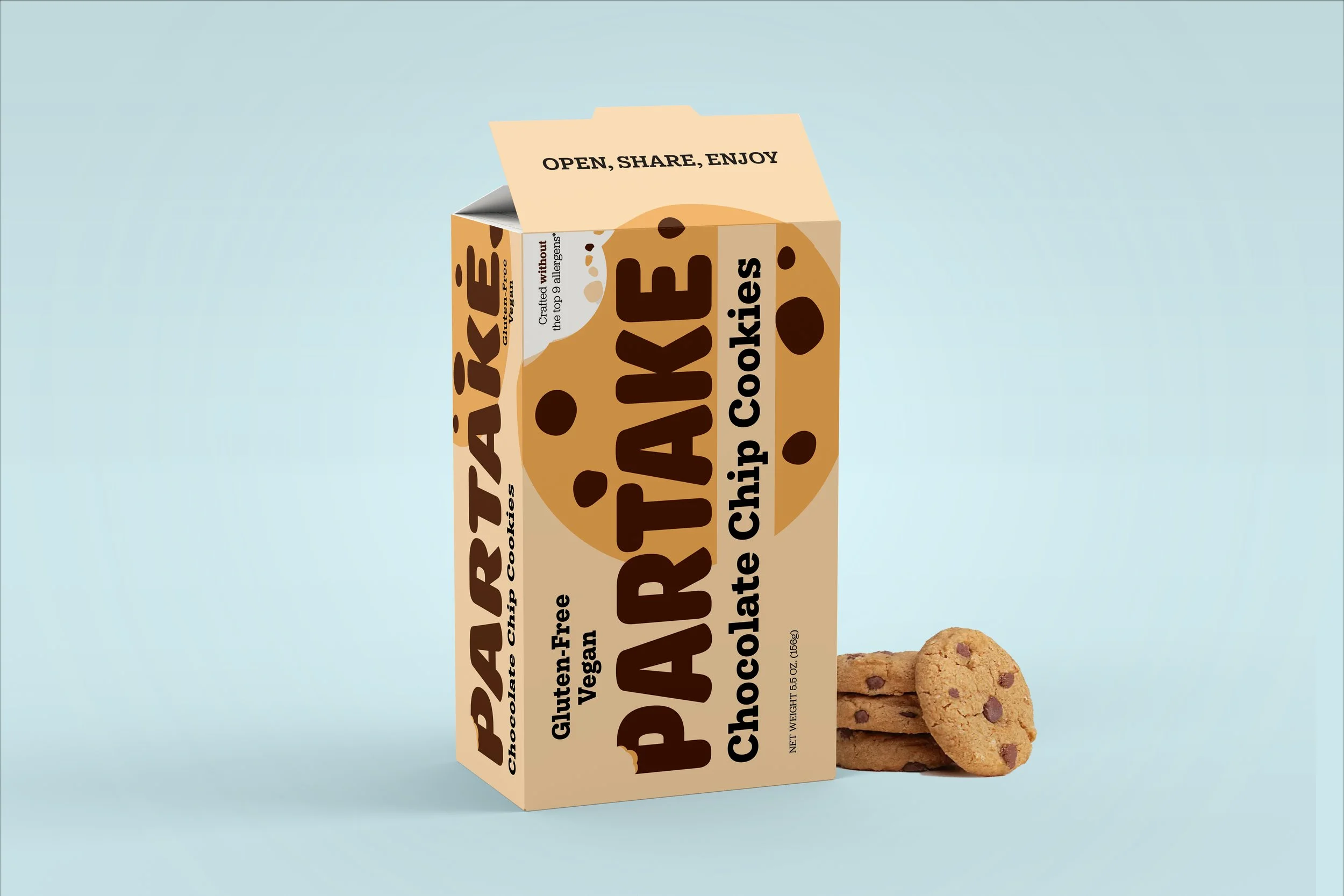
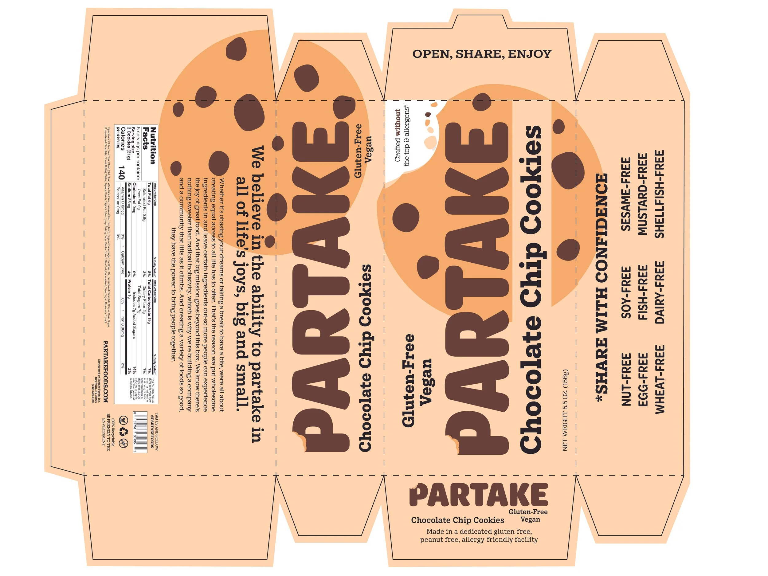
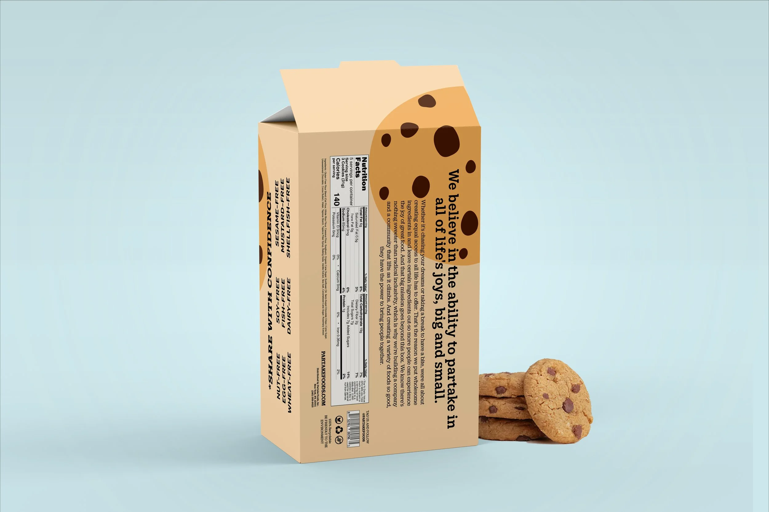
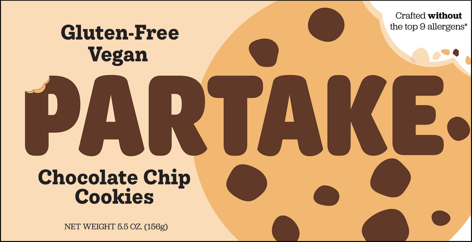
Partake is a Black-owned, allergy-friendly cookie brand created so everyone, regardless of dietary needs, can enjoy delicious snacks without hesitation. However, the existing packaging lacked shelf impact and did not fully communicate the brand’s joyful, inclusive mission. This redesign focuses on strengthening emotional connection, increasing shelf visibility, and aligning the visual identity with the core message: “Cookies Everyone Can Enjoy.”
Research & Strategy
My process included:
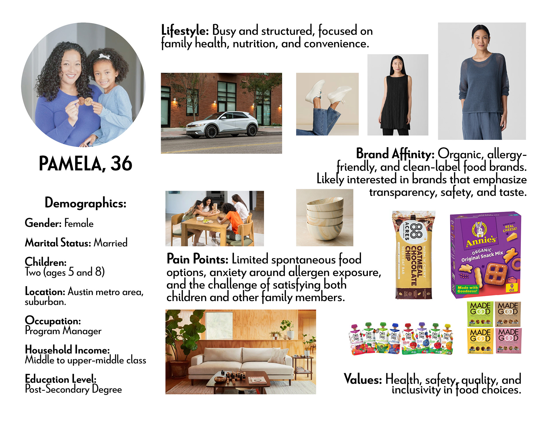
Persona development representing caregivers and snack-seeking kids
Shelf analysis of direct competitors in the allergy-friendly category
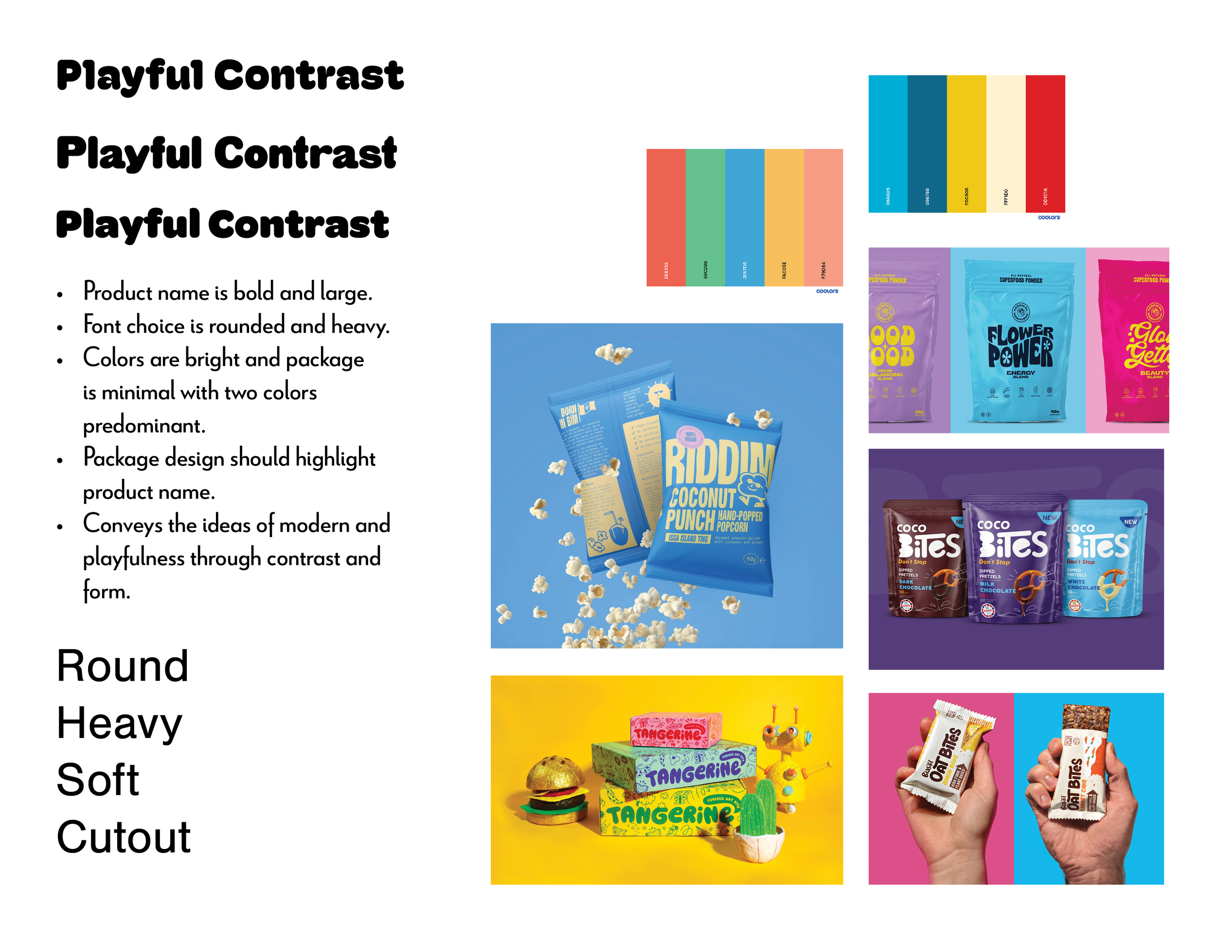
Mood board exploration centered on playful contrast and approachable simplicity
These insights led to a visual direction grounded in warmth, softness, and delight, characteristics that make the brand feel friendly and safe.
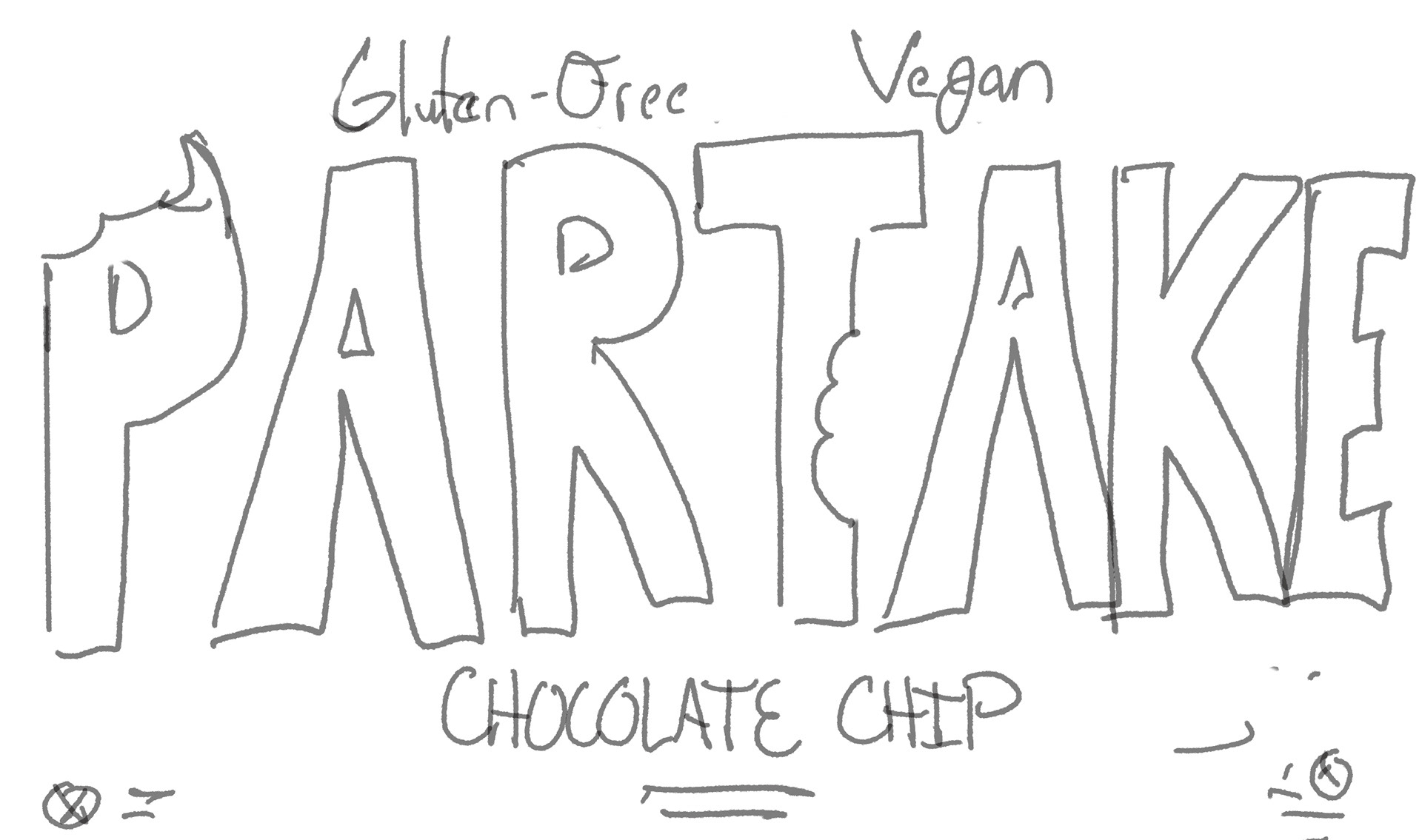
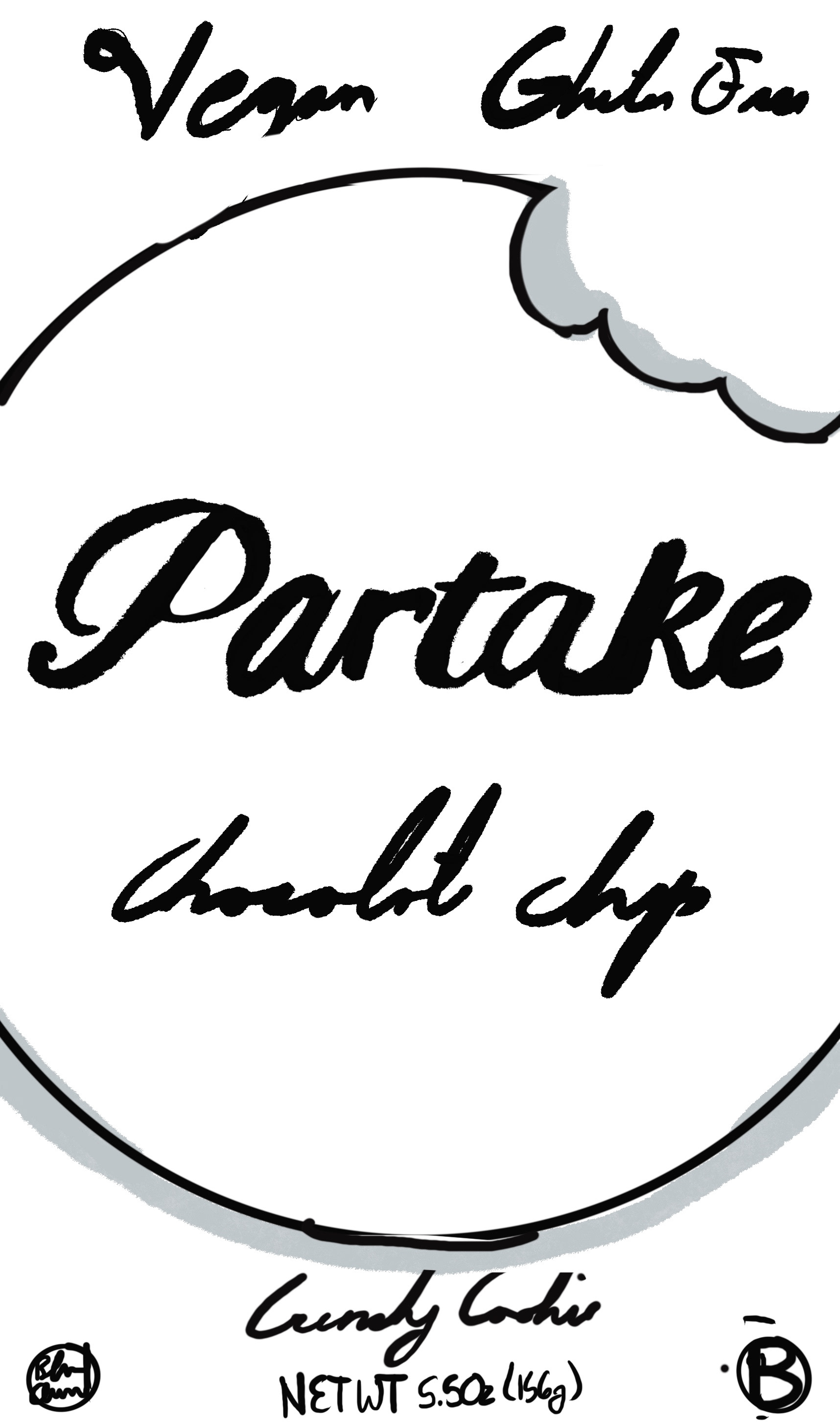
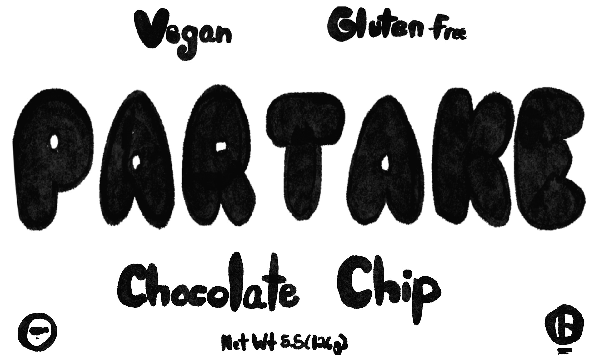
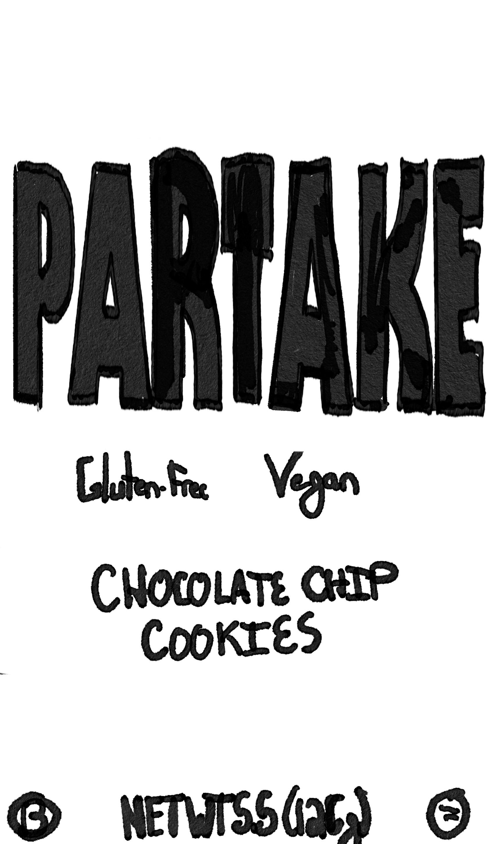
Design Exploration
I iterated through multiple style concepts featuring:
Rounded and cut-out shapes to convey approachability
High-contrast color blocking for quick recognition
Balanced, clean typography to support clarity and trust
A more dynamic composition that adds energy to the packaging
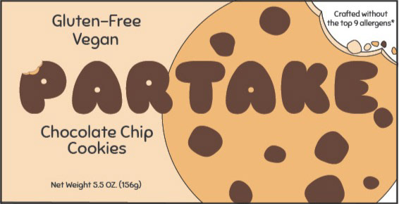
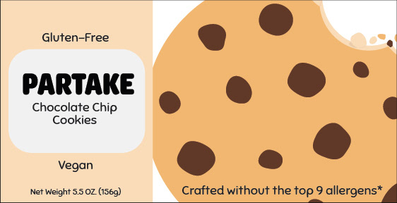
Outcome
The redesigned system enhances:
Brand recognition in store aisles
Emotional appeal by reinforcing joy and community
Consumer trust through clearer messaging
This project demonstrates how strategic visual storytelling can transform a package into a celebration of identity and belonging.